Los Angeles-based jewelry brand Tacori is updating its color palette, imagery, and messaging to tell the family-owned business’ story in a clearer, elevated way.
“The campaign introduces more narrative, character, and wit, which gives people a much broader sense of the brand beyond the jewelry itself,” says Bec Bowman, Tacori’s head of brand and creative.
Tacori worked with Studio Jae Jun Kim on the revamp, which the brand debuted at the Couture show during Las Vegas Jewelry Week and is now evident on its social media and website. “The response has been fantastic,” says Bowman, who joined Tacori in July 2025.
A recent Instagram post by Tacori explained the evolution well: “More expressive, more distinctive, and designed to celebrate individuality. This is just the beginning.” Tacori’s first campaign using its revamped look is called Movie Night.
Bowman tells JCK: “We are already seeing renewed interest from consumers, media, and the styling community, alongside some exciting red-carpet placements. What has been especially encouraging is that people are not just responding to a new look—they are responding to a clearer point of view and a more complete expression of who Tacori is.”

The project started with redoing Tacori’s logo, influenced by the jeweler’s signature Crescent design, which is sculptural and has subtle thick-to-thin movement, as well as the hand-engraving and metalwork of Tacori jewelry pieces. A fresh font did the rest, Bowman says.
Next, the branding team worked on finding the right colors to represent the Tacori name. They decided to use jewel tones, led by the well-known Tacori blue, a rich cobalt. Rose, orchid, mint, mandarin, violet black, and pearl hues complete the new palette.
“Tacori is a family-owned brand built around joy, personality, and some of life’s most meaningful moments. We wanted the new palette to bring that energy forward in a much more visible way,” Bowman says.
“The jewel tones feel rich, expressive, and full of life,” she adds. “They give us a stronger visual identity, create more distinction, and reflect what people are looking for now: luxury with more personality, emotion, and individuality. It feels elevated, but it also feels human, which is very true to Tacori.”
Once the new logo and colors were in place, Studio Jae Jun Kim went to work on a new visual direction. The result is imagery that evokes emotion, movement, and modern luxury. Product moments are paired with cinematic lifestyle storytelling, to immerse consumers in Tacori’s jewelry world.

While the brand refresh is exciting, Tacori remains rooted in family, craftsmanship, “modern vintage” design, and its iconic Crescent, says Nadine Tacorian Arzerounian, the company’s co-owner and head of design.
Tacorian Arzerounian’s father, Haig, who started Tacori in 1979, still has an office at the company’s headquarters. He created the Crescent—a hidden symbol of love on a Tacori ring’s inner face that resembles interlocking half-moons—with artisan Garo Kourounian, who also still keeps an office at Tacori. The company is run today by Tacorian Arzerounian and her brother Paul.
“Brands evolve, and their language has to evolve with them. Our previous voice served Tacori at a different stage, but we needed something sharper, more confident, and more reflective of the jewelry house we are today,” Bowman says.
“Tacori appears across many different channels and retail environments, so we needed a clear set of verbal codes that would make the brand feel consistent and recognizable wherever a customer encounters it. This work gives us that discipline while still leaving room for warmth, personality, and emotion.”
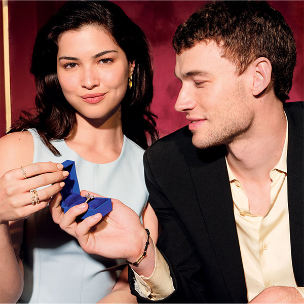
Top: An image from Tacori’s Movie Night campaign, its first since giving its brand identity an overall refresh (photos courtesy of Tacori)
- Subscribe to the JCK News Daily
- Subscribe to the JCK Special Report
- Follow JCK on Instagram: @jckmagazine
- Follow JCK on X: @jckmagazine
- Follow JCK on Facebook: @jckmagazine