When Mark Patterson and Josette Menassa met as students at GIA in the early 1980s—back when the organization still had its campus in Santa Monica, Calif.—he was a budding gemologist from Southern California and she was a Lebanese-European jewelry arts student residing in Rome.
Thirty-five years later, the story of how they built their brand, Mark Patterson, is the stuff of dreams: After graduating from GIA, the couple moved to New York City and began designing high-wattage jewelry for clients in Saudi Arabia. They exhibited at their first trade show in 1986, where their work immediately struck a chord with American retailers. Over the ensuing decades, Mark Patterson became a mainstay of the luxury jewelry scene.
After 27 years in New York City, the Pattersons headed west in 2007 to be closer to Mark’s parents in Southern California. In 2010, they opened their own retail store and adjacent atelier in Corona del Mar, an enclave south of Newport Beach. From their coastal perch, they, along with a team of 11 bench jewelers, continue to produce collections beloved by both retail and wholesale clients.
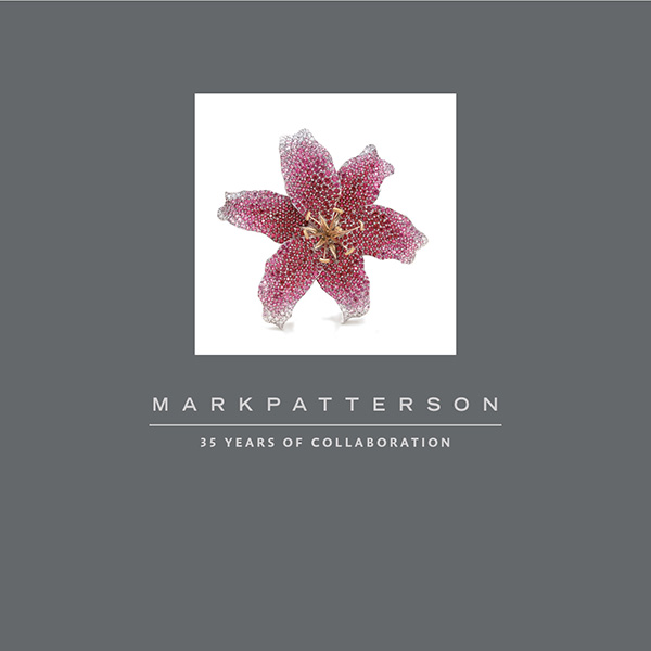
To truly appreciate Mark and Josette Patterson’s seemingly charmed journey through the fine jewelry industry, however, you must read the commemorative coffee-table book they published last month. Written by longtime JCK contributor Amy Elliott, the beautifully designed tome traces the brand from its beginnings in 1985 to present day, documenting each stage of the Pattersons’ creative evolution with the jewels that marked the way.
“Color was always their signature,” says Elliott. “That’s how I fell in love with them when I was an editor at Bridal Guide and on staff at Brides Local. The first time I ever saw a tsavorite was at their booth at the Centurion show. I’ve always thought of them as colored stone folks since that’s how they got their start.”
Below, we speak to Elliott about how she met the Pattersons, which aspects of their story she found most surprising, and what young designers just getting started in the industry can learn from them.
When did you see your first Mark Patterson jewel?
Probably in the early 2000s, when I was a young editor at Bridal Guide and went to the Centurion show for the first time. It was the first time I saw pavé tsavorite. Mark and Josette had a booth right next door to JFA Designs. I was the executive editor of Brides Local, Condé Nast’s regional wedding magazine collective (now defunct), and I was in charge of jewelry for cover shoots. I would always call on their rings for photo shoots. Then I went to Lucky magazine and freelanced for a while before taking a little break from the industry. I started covering engagement rings for About.com in 2016, and the Pattersons and I reconnected.
How did the book project come up?
Josette and I talked, and within a year or so she reached out and she said she wanted to do a book to commemorate this milestone in their business. I was very flattered and excited to take on the project. I knew the brand but wasn’t intimately connected to it. That required spending the weekend with Mark and Josette at their home in Huntington Beach in 2016. Josette is an artist and does beautiful ceramic sculptures, and Mark does woodworking. You definitely get the vibe you’re in an artist’s—make that plural, artists’—home. They’re very much living their best California lives. Mark and I did a couple formal interviews, but mainly, I hung out. They have this amazing vault in the back of their store with parcels upon parcels of stones, including a cache of tiny sapphires—like those they use for their ombré series, called Intensity.
What other research did you have to do to write the book?
Jim Rosenheim of Tiny Jewel Box was their first retail client. He saw them when they did their first JA New York show, when they were 25 years old. Jim’s a longtime loyalist of the brand. I had a long interview with him, and he helped me understand the retail mindset about what it was like shopping the shows back then. This was the era when designers first started to market their product under their own name. Mark and Josette were part of that.
You quote Jim in the book saying that Mark Patterson pieces “had their own voice.” How would you characterize that voice?
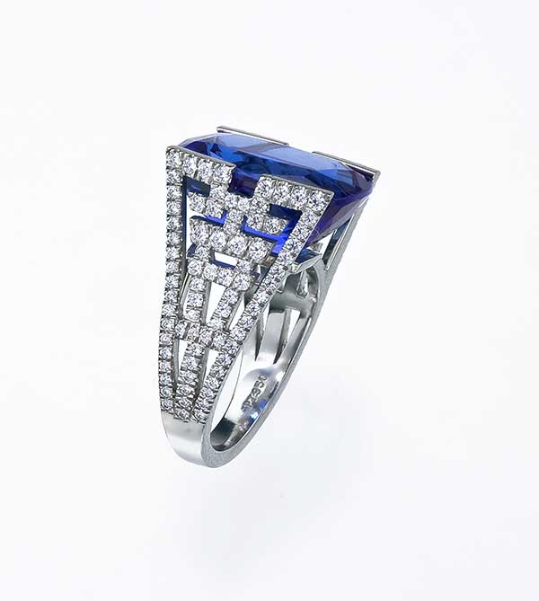
Clean, elegant, precise, considered, thoughtful, polished, shaped, and perfectly executed from all angles. One thing important to note about these two, and they acknowledge this, is they had excellent teachers. Mark was mentored by this old-school jeweler named Kurt Gaum. He had his own workshop in New York’s Diamond District, and he’s Swiss; he took Mark under his wing and Mark credits him as his most important mentor. Mark’s work is very precise. Every choice is considered. For a while, the way they worked is Josette would hand draw everything with gouache ink. As they’ve evolved, they do use CAD, but as Mark says, “It’s a problem-solving tool.” You have to have that engineering, mathematical mind to be into that sort of thing. Mark brings the physics and Josette brings that pan-European artistry.
Throughout the book, Mark Patterson’s use of high-quality materials is a refrain. What kind of gemstones come to mind when you think of the brand?
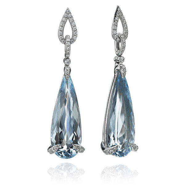
Pink sapphires, blue-green tourmaline, rubellite. They really are known for this elongated pear-shape drop, and they have done that in a bunch of different stones. They’ve used beautiful pink and purple gems, like on the orchid brooch on the cover of their book. Blue-green tourmaline and fancy colored sapphires are the stones that stand out to me as being exemplary of what they do.
Between all their colorful collections, do you have a favorite?
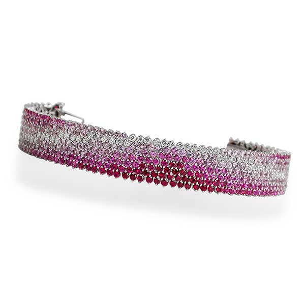
Samba. I remember seeing it long before I wrote this book. It had colors you didn’t know existed in nature. The stones are set like notes on a musical staff, like they’re dancing on a linear form. Historically, Intensity is the collection that put them on the map; it was their Cable bracelet. But since then, the collection that best encapsulates their look is Aura, which centers on this elongated pear shape. That’s become what they’re known for.
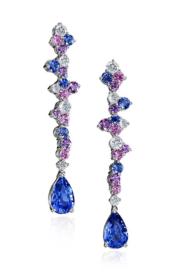
What’s interesting about that shape is when Mark discovered it when he was in Bangkok on a buying trip, the dealer was like, “No, you don’t want those, they’re an off cut.” And Mark said, “I love them.” And now it’s become their calling card. Also, color mixing is their thing—ombré color stories, but also pairing different gemstones like orange sapphires and citrine.
In the book you mention that Mark is drawn to shape first and foremost, not to color. Was that surprising to you?
Very surprising. But that drives home what he brings to the equation: Mark’s a problem solver. He is drawn to shape and engineering; that’s why he’s interested in furniture design. Form is what he’s drawn to.
Another thing I was surprised to hear: We talked about how they produced private label collections for Tiffany & Co. I asked him, what did you learn from that experience? And he said, “I learned about marketing. We didn’t have a marketing strategy.” And working with Tiffany, answering to that client, taught him about the marketability of a product and how important that is. I think their story is very interesting for young designers, how you get your start.
Mark was very wistful. He said he’d ride the train in from Westchester [N.Y., where he and Josette lived at the time] and he would think, what am I going to design today? It was a very free period. He’d see a rose petal in their backyard and have that be the basis of their next collection. It’s a perennial challenge: How do you reconcile your aesthetic and your big dreams with what is going to sell?
That’s one of the reasons they wanted to do this book—to mark the evolution of the brand. They started their business in the mid-1980s, they thrived, they listened to the market, they listened to their retailers, and were able to adjust. But in the beginning, I think of these two 25-year-old kids who met at GIA, then moved to the big city and started designing these incredible jewels with rubies and sapphires. Their story feels so relevant.
Note: Technically, the coffee-table book is not for sale. Rather, the Pattersons are requesting donations of $70 or more to the Lebanese Red Cross. To obtain a copy, email your receipt to josette@markpatterson.com.
Follow JCK on Instagram: @jckmagazineFollow JCK on Twitter: @jckmagazine
Follow JCK on Facebook: @jckmagazine