Is your logo tired? Does your website look dated? Is it time to update your business with a more contemporary look and feel? Here’s our guide to reinventing your brand.
Is New year, new you the motto you’re embracing in 2019? Reinvention can breathe new life into a brand identity, but it’s not to be undertaken lightly, especially in the fine jewelry space, where the weight of tradition can keep owners stuck in a rut. At the same time, change simply for its own sake isn’t enough. Retailers who have been there and branding experts who have worked with inventing and reinventing businesses inside and out (and online and off) have the advice you need.
Modernize With Restraint
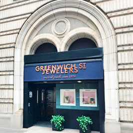
Jennifer Gandia, co-owner of Greenwich St. Jewelers in New York City, embarked on a rebranding in 2016 to coincide with the retailer’s 40th anniversary. The effort “gave us an opportunity to look at all of the ways we were representing ourselves in public spaces, which was a really valuable exercise,” she says.
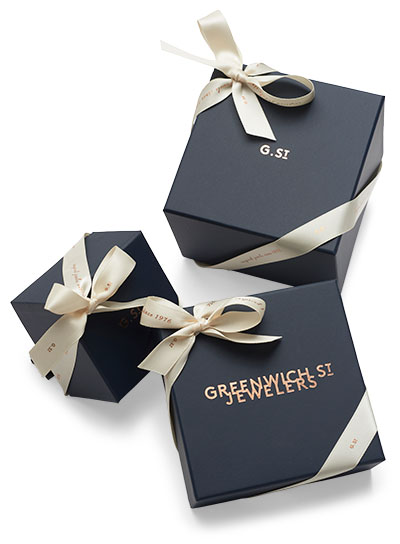
![]() Some rebranding initiatives involve overhauling logos, websites, and ads; others take it a step further. For Gandia, creating a simple, modern-feeling logo featuring the brand name in all capital letters; choosing a new brand color combination—a custom dark blue with rose gold—that appears in-store, online, and on the store’s new boxes and bags; and redesigning the website were part of a holistic refresh that also included a name change.
Some rebranding initiatives involve overhauling logos, websites, and ads; others take it a step further. For Gandia, creating a simple, modern-feeling logo featuring the brand name in all capital letters; choosing a new brand color combination—a custom dark blue with rose gold—that appears in-store, online, and on the store’s new boxes and bags; and redesigning the website were part of a holistic refresh that also included a name change.
By adding “St.” to the original name (Greenwich Jewelers), Gandia and her sister, co-owner Christina Gandia Gambale, were nodding to the business’ roots. Their parents, Carl and Milly, opened the shop in 1976 on Greenwich Street; they moved it to Trinity Street in the Financial District after the 9/11 attacks damaged the structure of their building.
“Our goal was to have all of the branding really reflect where the business was then, but also where we wanted to see it go,” Jennifer Gandia says.
Name Changes: Proceed With Caution
 “Names are one of the hardest parts of branding,” says Julie Cottineau, founder and CEO of New York City consulting firm BrandTwist.
Some of the challenges are logistical. “It’s really hard to find an available trademark and URL,” Cottineau says. Go into your search with an open mind, but don’t try to choose a new name by committee, and don’t rush into taking such a big step. You don’t want to confuse customers, or worse.
“I’ve seen clients say we’re going to hold a contest or name it after a Greek god—it shouldn’t be a democracy,” she warns. “Then you’ll end up with a name everybody can live with, but not a name anybody loves.”
 You also need to make sure people can still find you—particularly online. Changing a name could have implications for your search engine ranking. Since a key factor in search algorithms is a site’s traffic history, rebuilding your website under an entirely new URL could take that away.
Greenwich St.’s Gandia says keeping URLs for both names proved to be the solution: “Ultimately we had to keep the original domain. For that reason we have our new domain pointing to the old domain.”
Think Outside the (Jewelry) Box
 Don’t limit yourself to the jewelry sphere or even the luxury retail category in your search for inspiration, Cottineau advises. “Stop worrying about your competition. Look at brands you really admire outside of your category,” she says. “The further away you can get from luxury jewelry, the better for inspiration.”
For one jeweler, the creative spark was an iconic landmark. In November, Las Vegas–based LV Luxury Holdings added LV Luxury Jewelers to its portfolio of brands. Vice president Christine Sidoris says LV Luxury Holdings’ executive team didn’t consult with a branding agency, but instead brainstormed in-house to develop the new logo, an angular diamond shape with two rounded corners.
“For the shape of the logo, we thought it looks visually like the shape of the ‘Welcome to Fabulous Las Vegas’ sign,” Sidoris says. “We took that shape to make it really our sign, our logo.” The shape also riffs on the idea of a diamond—referencing the parent company’s logo of a gem-cut diamond without imitating it.
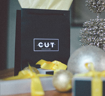
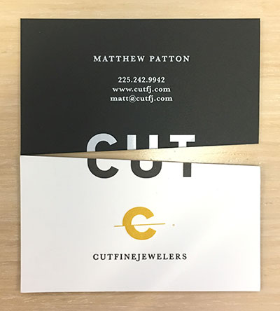 Matthew Patton, owner of Cut Fine Jewelers in Baton Rouge, La., took inspiration from Apple’s iconic packaging. “I’m 32—I don’t have the same mentality as someone who’s been doing this for 50 years,” he says. “When you buy a new iPhone or a new MacBook, isn’t part of the experience the sleek, sexy packaging it came in?”
Patton takes pride in Cut’s distinctive silver boxes, and even its award-winning business cards stand out, with double-thickness card stock and an eye-catching cutoff logo. “The things we hope people will keep and retain are our business cards and our boxes,” Patton says.
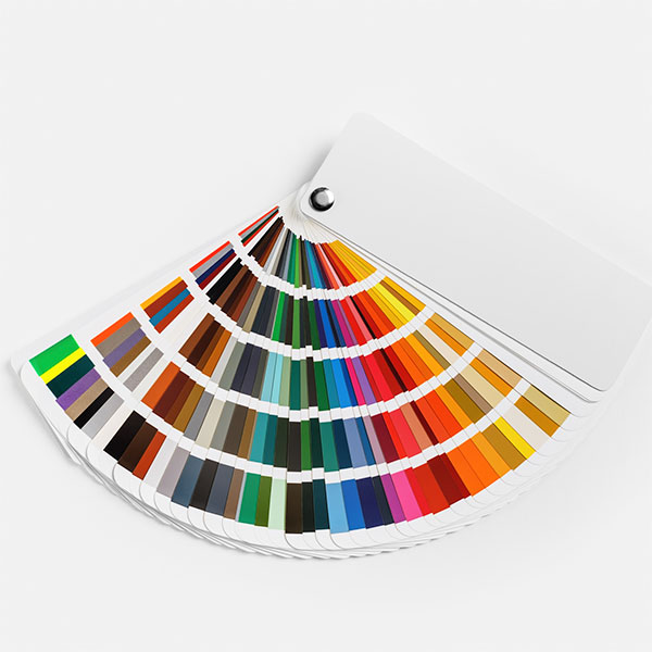
Pick Versatile Fonts and Colors
Whether you work with a branding agency (which many retailers who plunge into a full brand overhaul do) or go it alone, give careful consideration to colors and typefaces. Retailers today need to choose a look that will read equally well on a store window or awning and on a thumbnail image on a social media app.
 When it comes to color, branding experts recommend picking just one or two, and avoiding ubiquitous trendy hues (which tend to look dated sooner). Gandia, for example, bridged classic and modern with Greenwich St.’s dark blue and rose gold combo. “We wanted something that reflected a sort of downtown sensibility that didn’t feel too stodgy,” she says.
Ellen Fruchtman, president of Fruchtman Marketing in Toledo, Ohio, recommends printing out the typeface you want to use in your color of choice and putting it across the room so you can view it from a distance. “Do you do a lot of billboard or print? You want to make sure the typeface can transfer. Very thin or script-y fonts can be difficult to read,” she says, and some colors offer better readability than others.
Likewise, Fruchtman says, very detailed logos might not render well when shrunk down, a serious consideration given that many customers might be introduced to your brand via a mobile device or social media app.
For this reason, retailers like Gandia and Patton say their branding toolboxes include simplified versions of their logos that can be utilized for small or more low-key spaces, or in situations where print quality might be an issue.
Keep a Consistent Theme
“If you’re rebranding, you’re rebranding everything—you’re not just slapping on a new logo,” Fruchtman says. “There should be a new look and feel for everything from your marketing to your interiors to how your cases are displayed.”
When Patton developed his branding in conjunction with a move to a retail storefront from a referrals-based business a few years ago, he deliberated over every detail. His brand’s signature deep shade of yellow, for instance, is incorporated in the logo (a stylized rendering of the word cut with a slash through it), which appears on gift packaging and on the store website and is stitched on staffers’ shirts.
Having every element of the Cut Fine Jewelers brand look similar is deliberate. “It’s basically just continuing to reinforce that brand message,” Patton says. “Whenever you look at something from us, we have this particular style and always putting cut in there is continuing to reinforce that brand every single time. If anything is going to be remembered, it’s going to be our name.”
(Color swatches with hands: Orbon Alija/E+/Getty; color guide: Veresovich/iStock/Getty)