Warm, washed-out hues also made the list
This week Pantone released its Fall 2017 Fashion Color Report—an annual overview of fashion designers’ use of color for the season. And a pair of potent, sizzling red tones came in at No. 1.
For the first time, this year the report analyzed collections at both New York and London Fashion Week to determine the top 10 trending colors in fashion, jewelry, and accessories.
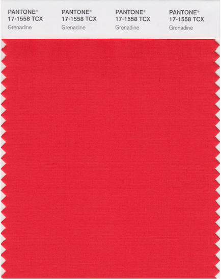
New York Fashion Week’s color rundown, which is topped by the orange-tinged Grenadine red, “leans more to warmth,” says Leatrice Eiseman, executive director of the Pantone Color Institute, in a statement. “While comforting, enveloping colors and ease are crucial to the seasonal feeling, standout shades include a pale pink Ballet Slipper, a refreshing Golden Lime, and a bright Marina blue. These hues add a striking touch when paired with the classic autumnal shades of Navy Peony, Neutral Gray, Butterum, and Tawny Port.”

Pantone characterizes Grenadine as “a confident and self-assured attention-getter.”
Here are the other top tones from New York:


Flame Scarlet, a potent midtone red, opened the “strong, classic” color palette at London Fashion Week. “Led by a vivid Flame Scarlet, the color palette for Fall 2017 is comprised of strong classics colors complemented by a few unpredictable shades for the autumn and winter seasons,” said Eiseman in the same statement. “Unexpected combinations such as Royal Lilac and Otter brown or Lemon Curry with Bluebell are eye-arresting and create an unusual color dichotomy.”

Pantone calls London hue Flame Scarlet “a vivid, powerful red.”
Here are the other top tones from London:


The colors Pantone experts distill for the report are eventually used to create the Pantone Fashion Color Report, which serves as a reference throughout the season for fashion fans and retailers.
Follow JCK on Instagram: @jckmagazineFollow JCK on Twitter: @jckmagazine
Follow JCK on Facebook: @jckmagazine