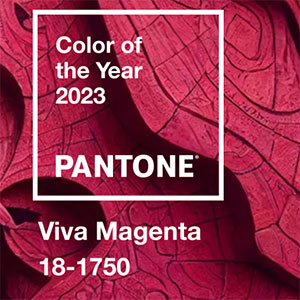
The Pantone Color Institute has announced 2023’s Color of the Year: Viva Magenta (Pantone 18-1750), which it calls “an unconventional color for an unconventional time.”
“It is a shade rooted in nature descending from the red family and expressive of a new signal of strength,” said a statement from the Carlstadt, N.J.– based color authority. “Viva Magenta is brave and fearless, and a pulsating color whose exuberance promotes a joyous and optimistic celebration, writing a new narrative.”
JCK contributing editor Amy Elliott calls Viva Magneta a “a joyous, celebratory color, perhaps a signal of some good news and good vibes to come.
“Viva Magenta aligns with an overarching hot pink trend that the jewelry world has been tracking since JCK Las Vegas 2022,” she says. “This magenta appears to be a nuanced shade with some reddish and purple undertones and that translates to all manner of pink tourmaline, rhodolite garnets, and other garnets in what we might call the raspberry color family.”
She adds, “This is not a bubblegum or Barbie pink but something deeper, richer, and stronger, and, thus, I think it points to a message of female empowerment.”
In a video introducing the new color, Laurie Pressman, vice president of the Pantone Color Institute, said the new color “vibrates with vim and vigor.
“Powerful and empowering, Viva Magenta is an animated red that encourages experimentation and self-expression without restraint,” she continued. “It’s a nuanced crimson red tone. It presents a balance between warm and cool. It’s also a hybrid color, one that comfortably straddles the physical and virtual, evocative of our multidimensional world.
“It’s audacious, it’s witty, inclusive of all. Viva Magenta welcomes everyone and anyone with the same rebellious spirit. Assertive but not aggressive, a carmine red that takes what we like to call a ‘fist in a velvet glove’ approach.”
Pantone’s Color of the Year for 2022 was Very Peri, a “warm and friendly” blue tone it just created and added to the Pantone roster.
Photo courtesy of Pantone
- Subscribe to the JCK News Daily
- Subscribe to the JCK Special Report
- Follow JCK on Instagram: @jckmagazine
- Follow JCK on X: @jckmagazine
- Follow JCK on Facebook: @jckmagazine