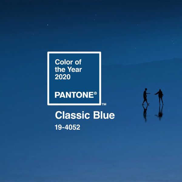
Pantone has announced its 2020 Color of the Year, setting the tone for what feels like a fresh start as we get ready to usher in a new year.
Classic Blue, described by Pantone as reassuring, familiar, and “elegant in its simplicity,” is a welcome choice as we embark on a new decade, a purposeful selection by the color giant.
“We are living in a time that requires trust and faith,” said executive director of Pantone Color Institute Leatrice Eiseman, in a statement. “It is this kind of constancy and confidence that is expressed by Classic Blue, a solid and dependable hue we can always rely on. Imbued with a deep resonance, it provides an anchoring foundation. A boundless blue evocative of the vast and infinite evening sky, Classic Blue encourages us to look beyond the obvious to expand our thinking, challenging us to think more deeply, increase our perspective, and open the flow of communication.”
Though I always thoroughly anticipate and enjoy the annual announcement of Pantone’s Color of the Year, I often find myself to be a skeptic of its choices: Past champions such as 2019’s Living Coral and 2018’s Ultra Violet had qualities that struck relevant chords at the time, but they ultimately didn’t feel like the kind of hues that could truly dominate, or really represent, a year.
Many retailers look to this announcement to spark sales, jumping on the bandwagon with both official Pantone and non-licensed goods. And I’m certain they sell—this announcement spurs excitement and optimism for the year ahead, and we as consumers really like having our expectations managed when it comes to the trends that promise to define our future seasons. But it often feels like the hype doesn’t have any stamina: In 2012, for example, I remember purchasing a selection of Color of the Year Tangerine Tango–branded products from Sephora (boy, was I enthusiastic!). Those same products were heavily discounted months later.

Fortunately for jewelers, the color commitment isn’t quite so drastic. Tangerine Tango may not have altered an entire industry of gemstones, but it did spark an interest in stones such as fire opal, for example, simply for the features the Color of the Year inspired. A retailer may not have stocked all of their showcases with the stone, but it didn’t hurt to create of display of the ones already in their possession, leading shoppers to experience a whole new option of color.
But then there’s Classic Blue, and this feels different. Pantone isn’t reinventing the wheel here, and that’s a very good thing in my opinion. Some may see it as boring, but this choice is familiar, tranquil, and easily relatable. We know this blue. We like this blue. This blue is good.
Sapphire is the gemstone equivalent of Classic Blue: tried-and-true, versatile, and beloved. My guess is we’ll see it at the center of more engagement rings than ever come 2020.
True to Pantone’s intention with its selection of 2020 Color of the Year, Classic Blue just feels right. For the first time in a long time, I’ve got a good feeling about this one.
(Top image courtesy of Pantone)
- Subscribe to the JCK News Daily
- Subscribe to the JCK Special Report
- Follow JCK on Instagram: @jckmagazine
- Follow JCK on X: @jckmagazine
- Follow JCK on Facebook: @jckmagazine